Congratulations Dominique and Grad 2020—Jury identifies top case studies submitted by RGDs in 2017
““The power of insightful design was unfurled in this process-trumps-the-product assignment by instructor Dominique Walker. Knowing what to craft is just as important as knowing how to craft. The intellectual quotient was placed on the same pedestal as the emotional, with students learning the skills behind observing and mining true meaning behind the designs they create. Creative folk (and journalists like myself) can relate to and appreciate the lessons learned from this exercise in design thinking — such as the art of instilling confidence through calming interview techniques or obtaining the right information that results in truthful work. Looking at the final products and post-interview quotes, I find myself wondering what posters the students would create for themselves if they, too, were asked to reveal a lesson they gleaned for future budding designers to heed.””
'It's All In Your Head' poster by Emily Huynh (shown above)
To develop interview skills and better understand client relationships, first year students were asked to interview local seniors and capture their 'words of wisdom' in posters that would appeal to a target audience of 18-24 year olds.
Soft Skills vs. Hard Skills
One of the key things you realize when you start working as a designer, or start hiring designers, is that soft skills are just as important as the hard skills. It is equally important to be good at listening, to work well with others, to be on time, to be clear about expectations and to take (and give) feedback effectively as it is to be skilled at using the Adobe creative suite, writing briefs, pairing type, generating ideas, and so on.
Students often don’t recognize the soft skills that they need to develop because most assignments only evaluate the hard skills. How ‘nice’ you are to work with is often written off as an intangible.
Many of these ‘soft skills’ are old fashion manners, like standing when someone comes into a room to greet them, looking someone in the eye while speaking to them, speaking clearly, showing up on time, being respectful, listening without multitasking, etc. These things that were drilled into past generations in a way that they haven’t been with current generations.
Having the students work with seniors provided an opportunity to address these skills directly. If you’d like your senior to hear you, you must speak clearly and look at them while speaking. If you’d like them to feel comfortable, don’t take notes on your phone, use a piece of paper and pen while interviewing. What is the first thing you do when you meet them? Offer a hand and introduce yourself. Spend a few minutes making them comfortable before launching in. At the conclusion of the project, the seniors were asked to give written feedback on the students’ soft skills and how they could improve them.
These skills make the difference for whether or not a client meeting will go well and can impact whether your creative director understands what you're trying to do. Soft skills are what determine whether your peers enjoying working with you or not and can lead to the next step in your design career: being asked to present work to clients, being asked to represent their company at talks or events and other important opportunities. Without them, you might find yourself getting left behind.
Evolution of the project
Launching for the first time last year, the assignment asks first year students to visit Silver Harbour Seniors' Activity Centre in North Vancouver to interview seniors about their experiences and use graphic design to help share an important life lesson. This year's students had the additional challenge of designing a poster that would resonate with a target audience of 18-25 year olds.
Adding the element of the target audience made honest group critiques of the posters very easy. As the target age group, students were able to offer relevant feedback on each other's work by sharing their personal tastes and opinions.
Posters were put on the wall, and students asked their peers the following questions:
- If you were walking down the hall on your way to the cafeteria, would you notice this poster? If not, why?
- What is it about the illustration style, colour palette, font choice, wording, hierarchy of information, etc. that is not working?
- How could it be improved?
Real-world applications
This project helps students develop the following skills:
- Information-gathering through interviews and research
- Copywriting: distilling information down into a concise, understandable phrase
- Idea/concept generation: understanding how do you take information and make it 'sticky', i.e. interesting and memorable
- Poster design: understanding hierarchy of information, composition, type pairing and selection, illustration style and composition, etc.
- Presentation skills
- How to take feedback and learn from it
This is a great project that helps designers and illustrators to grow in a number of ways. It will definitely stay part of the curriculum.
From the students:
What was the most challenging part of completing this project?
“The most challenging aspect was finding the right question that would receive the most insightful response from a client who didn’t know me on a personal level.”
'Count Your Lucky Stars' poster by Brynn Staples
“The most challenging part of this project was transitioning the ‘piece of wisdom’ into copy that wasn’t cliche. With so many inspirational quotes out there how could you make theirs unique?”
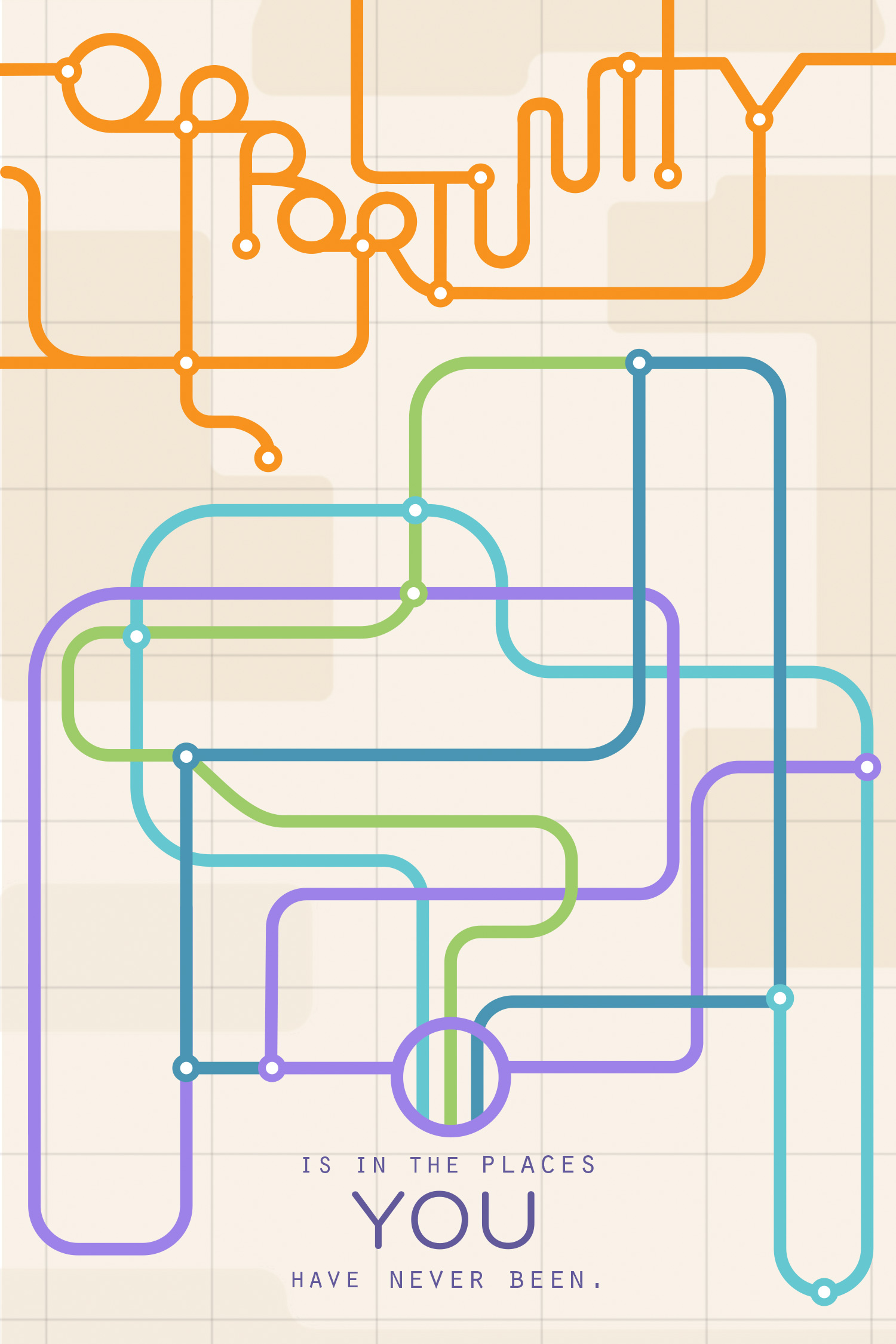
'Opportunity' poster by Nicole Shewchuk
“The most challenging part of the project for me was distilling the senior’s life lesson into a poster that spoke to the senior’s unique experiences and also resonated with our target audience – young adults.”
'No Risk, No Reward' poster by Nada Hayek
“Learning and working with a new visual medium. Sometimes you come up with a solution to a design problem, step back and think ‘shoot, I don’t know how to actually do this’. And if it’s the best solution to the design problem, then your only choice is to start learning.”
'Change The Things You Can' poster by Jennifer Panata
“The most challenging aspect was trying to visually represent the senior’s advice while also trying to capture the voice and personality it came from. It was difficult, but important.”
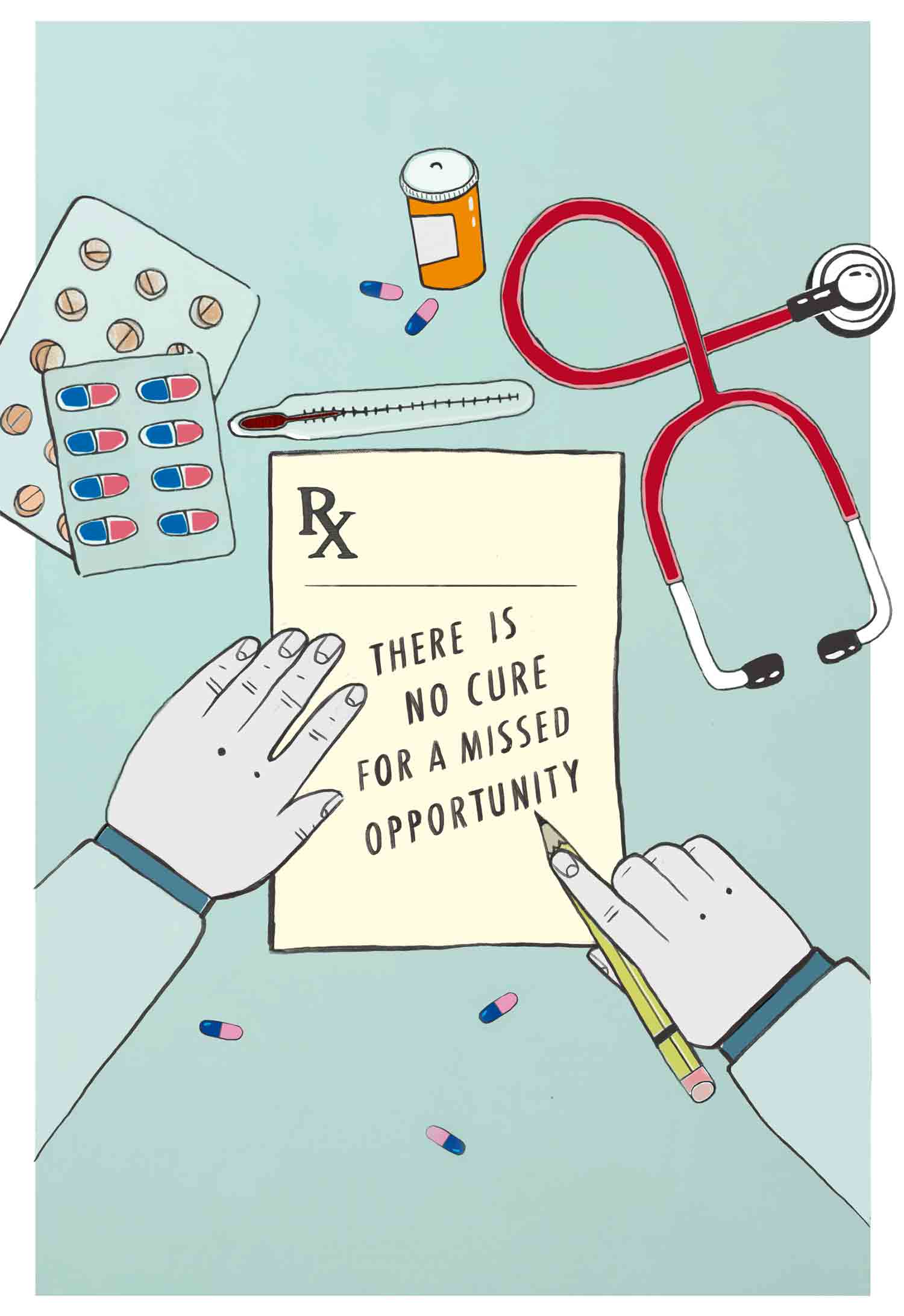
'There Is No Cure For A Missed Opportunity' poster by Alex Joukov
“Translating and distilling the senior’s ‘words of wisdom’ into a conceptual idea that the target audience can relate to, while keeping true to the senior’s personality.”
'Find Delight' poster by Evelyn Chua
What were your main takeaways from your experience working on this project?
“I had an ‘aha’ moment while interviewing the client when I realized that the answers weren’t necessarily in her words, but rather in her body language.
”
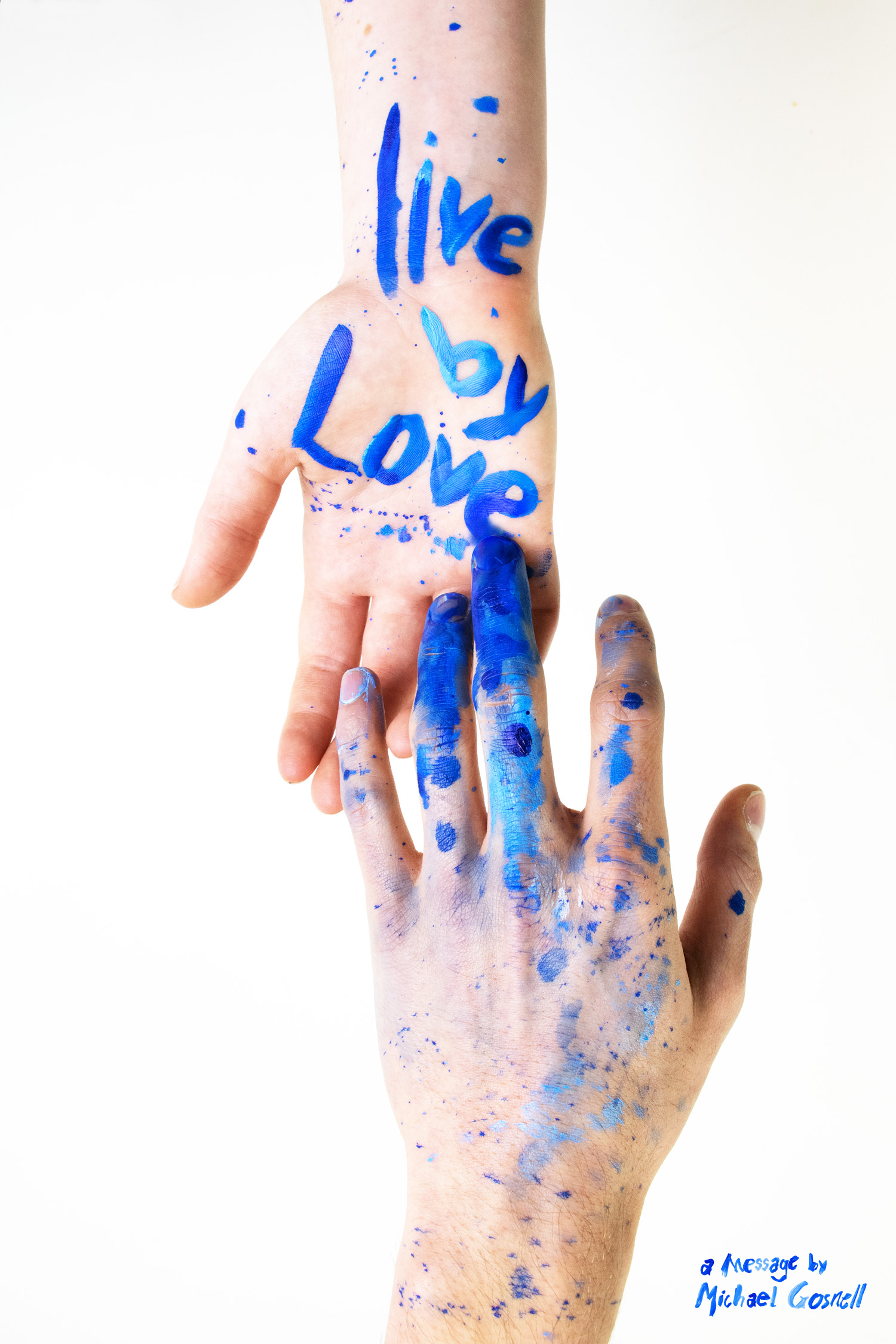
'Live by Love' poster by Danielle Adams
“The interview process was especially eye-opening. It was a valuable lesson in understanding what questions to ask, how to ask them and how to build good relationships with clients.
”
'Laughter Warms The Coldest Days' poster by Sydney Toews
“Word choice is incredibly important. It’s important when you’re making a poster and it’s also important in conversation. Remembering to thank someone for their time, calling them by their name, that stuff means a lot.”
“Communication is important. You’re collaborating with the client, rather than rehashing what they tell you.”
'Life Is A Labour So Laugh With Your Neighbour' poster by Jack Comer
If you could give one piece of advice to next year's class of design students tackling a project like this, what would it be?
“My two cents to future design students is to look for the answers you need in every detail when meeting the client. Listen to their words, read their behaviour, look at the environment they surround themselves with and look where you may not expect to find the response you need. Make the impersonal, personal.”
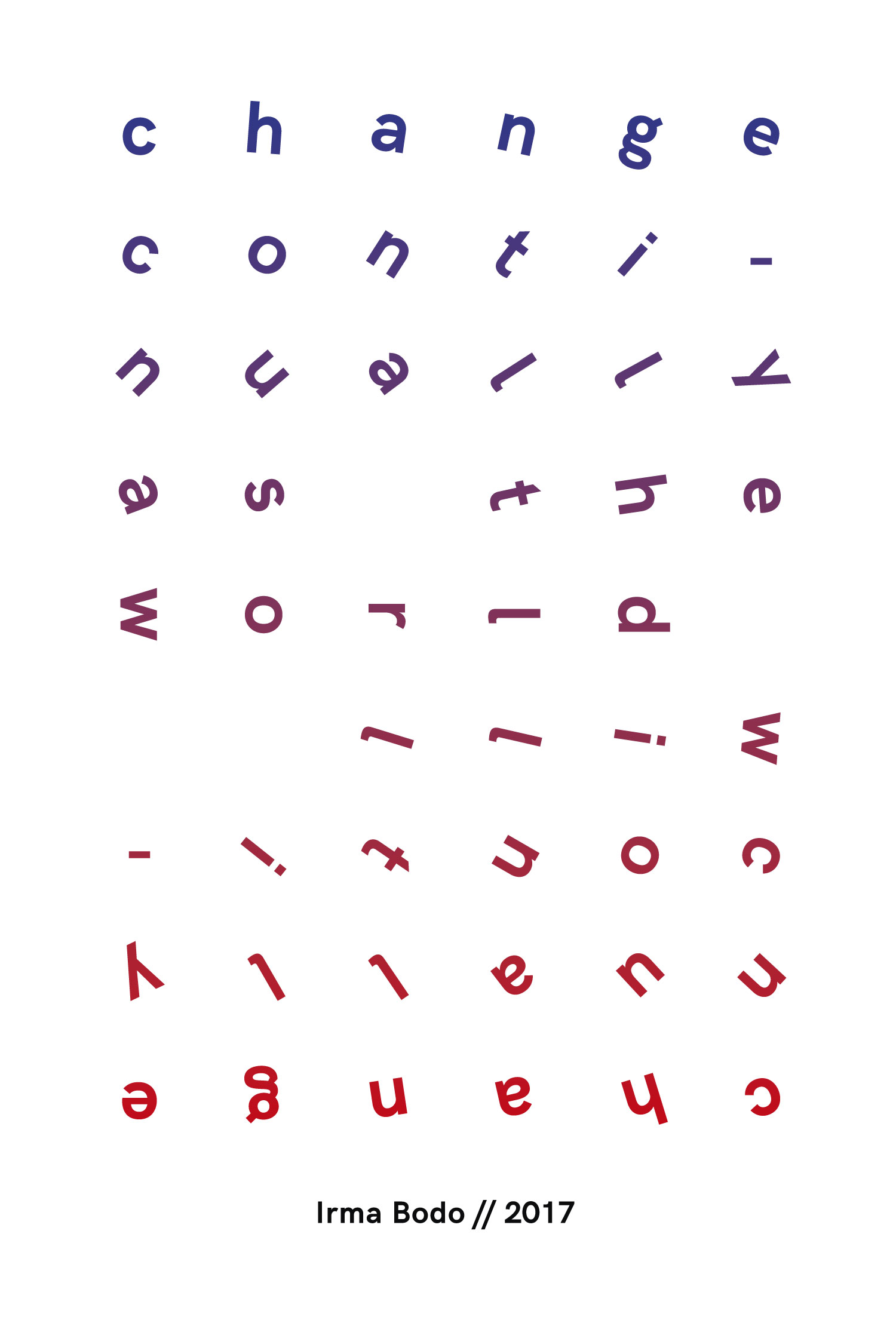
'Change' poster by Isaac Mak
“Take a step back from your original idea and tackle the project from a different perspective.”
“Listen to your client, don’t be afraid to go back and ask more questions and have fun with it. The seniors are entrusting you with their stories; tell them in a way that makes others want to listen too.”
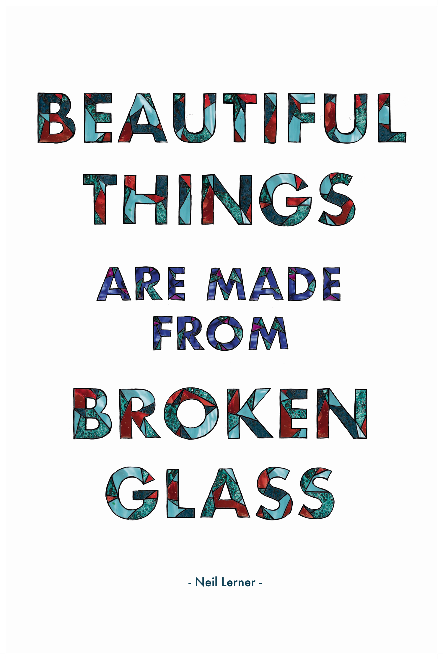
'Beautiful Things Are Made From Broken Glass' poster by Heather Haughn
“People want to be good interviewees – in most interviews, the person on the other side of the table is just as nervous as you are. Half the job of the interviewer is convincing the person you’re interviewing to relax.”
“Ask questions, not just for the purpose of the project, but for you personally as well. They will surprise you and you may have more in common with them than you imagined.”
“Don’t be afraid to go on tangents. You’ll get a much more authentic response, if you don’t shape your questions around the task at hand. Focus on simply getting to know the person instead.”
'We Choose What We See; Reality Is An Illusion' poster by Danica Koller
About RGD's Top Case Studies
Each week, Association of Registered Graphic Designers (RGD) features a project case study by a Certified RGD Member. Four industry professionals with a business/media background identified the case studies submitted in 2017 that they feel best articulate the design process and demonstrate the value design can bring to business.
RGD's case studies highlight the thought, research and insight involved in developing a project, providing details on challenges, solutions and results that often occur through the design process. By establishing an archive of case studies that cover a wide range of projects, RGD's goal is to build understanding and respect for the role of design in business and put a spotlight on the specific objectives and deliverables that can be addressed through the power of design.
For the full details, see: Capilano University's IDEA School of Design prioritizes soft design skills with unique first-year assignment


