

“Hue” by Anais Bayle (IDEA Grad 2024) is a top packaging and menu design project created in IDEA School of Design’s Branding Concentration
“Hue” by Anais Bayle (IDEA Grad 2024) is a top packaging and menu design project in IDEA School of Design’s IDES 362 Visual Communication Studio I: Branding Concentration with Dominique Walker.
Check out this top student packaging and menu design project from our branding concentration!
The Packaging Series
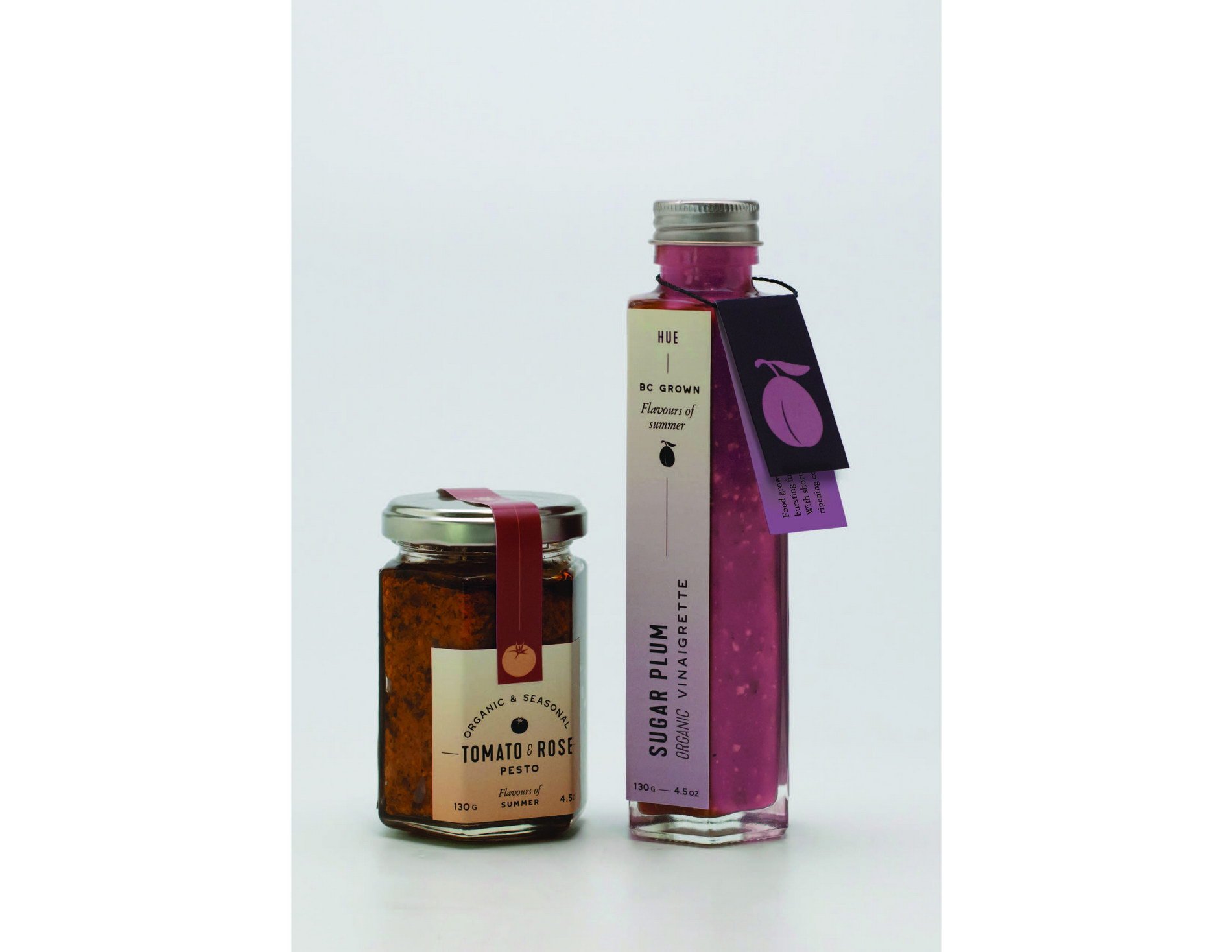
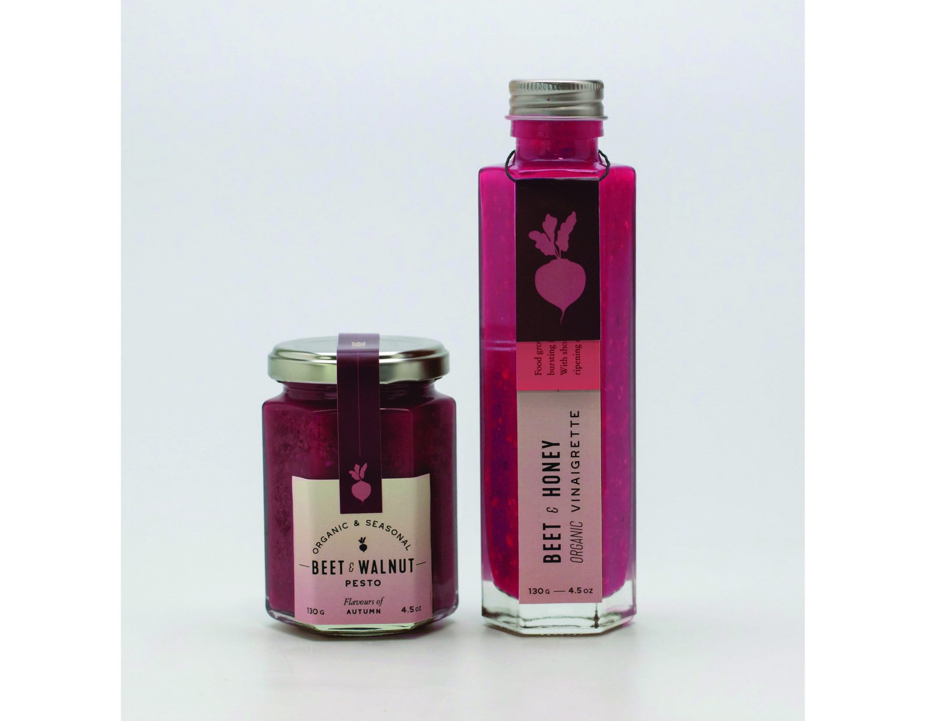
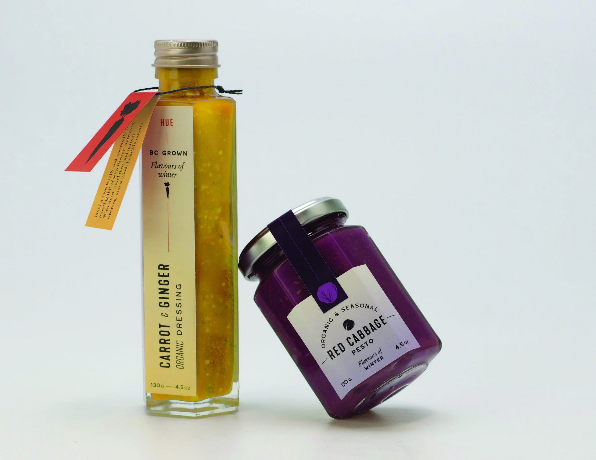
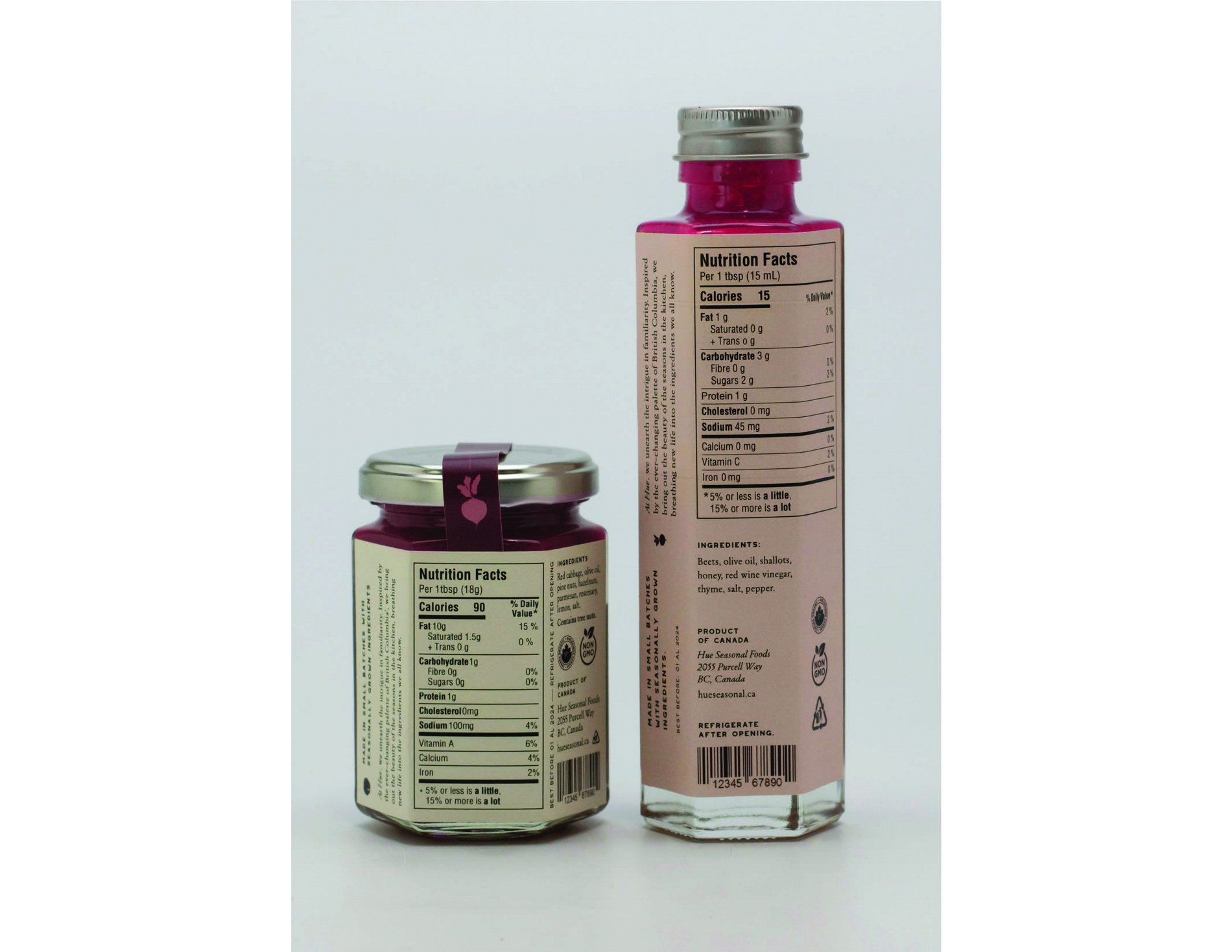
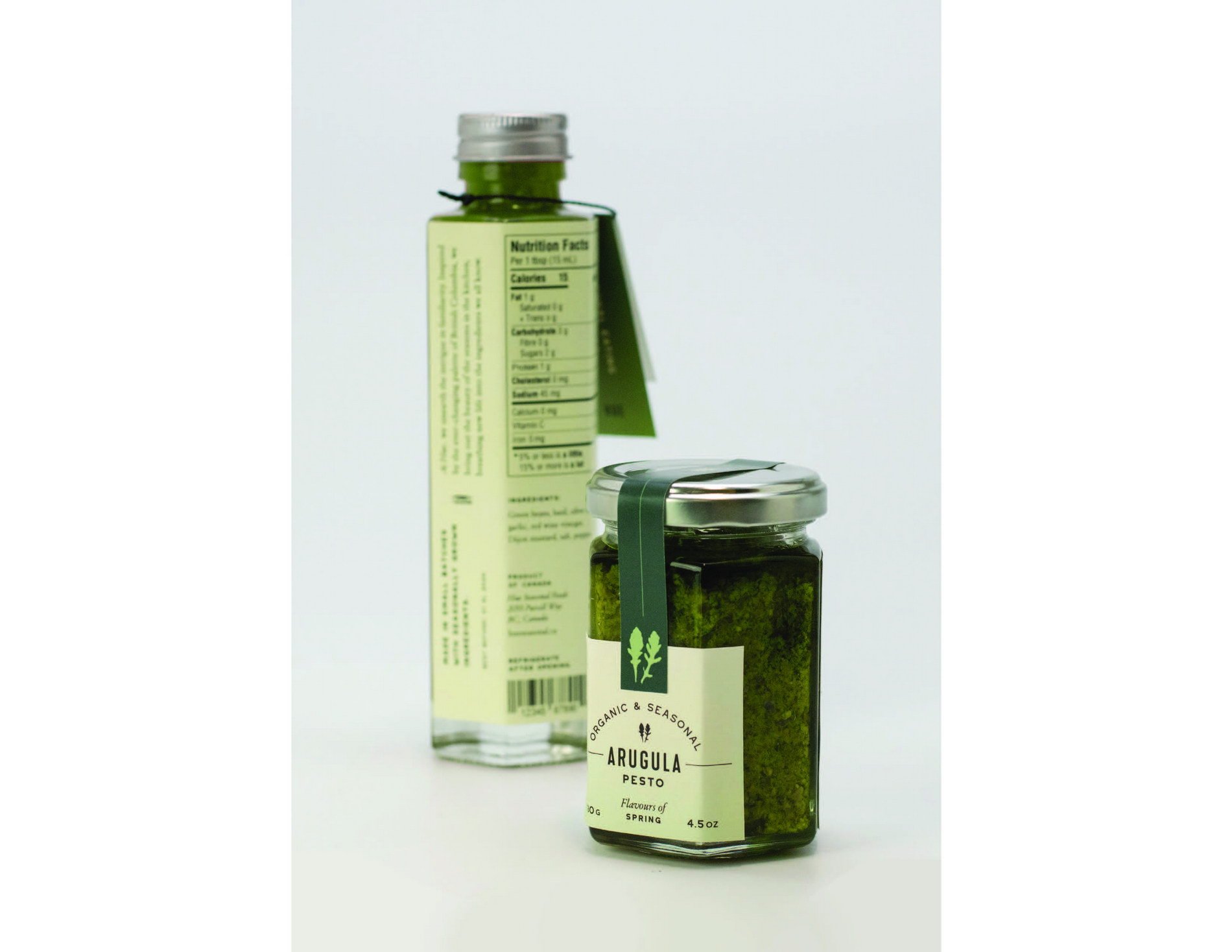
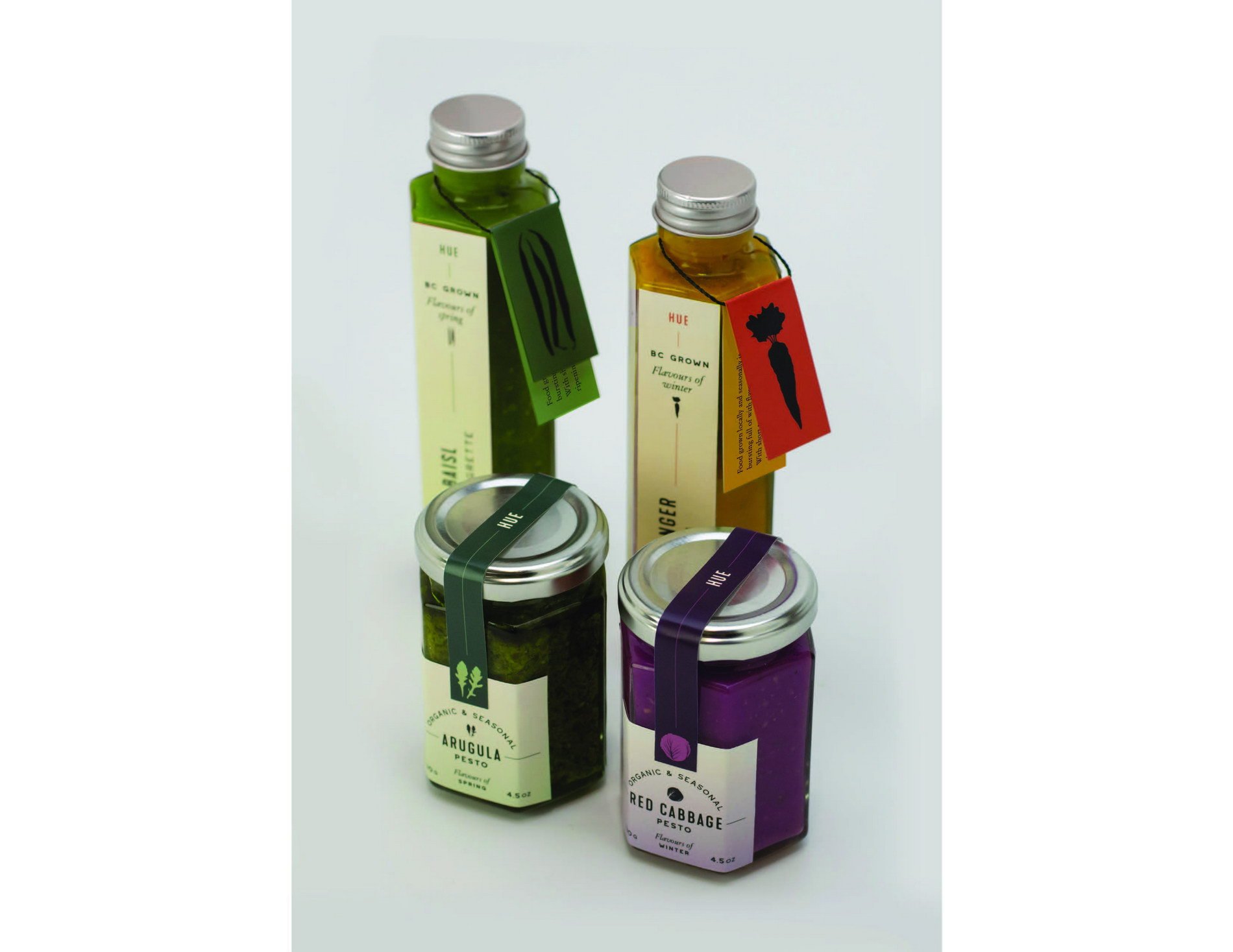
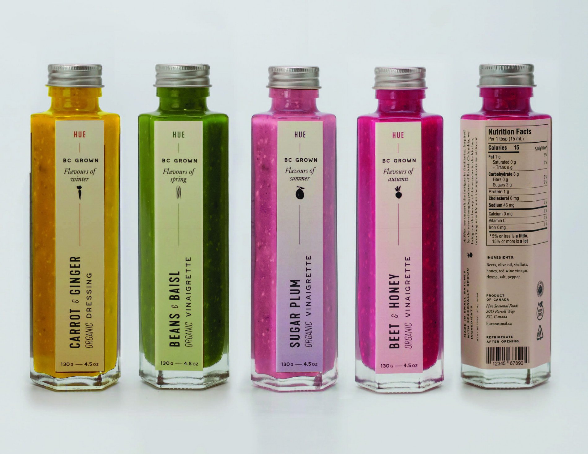
The packaging series for Hue evokes a sense of quality while maintaining a hand-made, natural feel, which communicates the high-quality locally grown ingredients used in the products. The products are packaged in glass jars to allow for the unique colour of the insides to shine through, a key selling point of the brand. The packaging ensures to communicate the value of local & seasonal foods, while taking a diff erent approach to the visuals. The colours of each label are inspired by the colours of their respective contents, to create unity between design and label.
As Hue equally values seasonal food, its vibrant colours, and making familiar food interesting, it was important that the products themselves be intriguing hues. Having these unusually coloured products on the shelf would spark customer’s curiosity, eff ectively unearthing the intrigue in familiarity by challenging what classic dressings & pestos look like while enticing the customer to try something new—something made with ingredients they know but used in a way they are not accustomed to.
The hangtags on the tall bottles add visual interest and communicate brand purpose (importance of seasonal food). If they are misplaced, the packaging is still fully functional, which would minimize product loss in stores. The use of icons makes the packaging feel more approachable and allows for further distinction between fl avours. The use of gradients is reminiscent of Hue’s menu, which in turn represent the various hues present in seasonal produce.
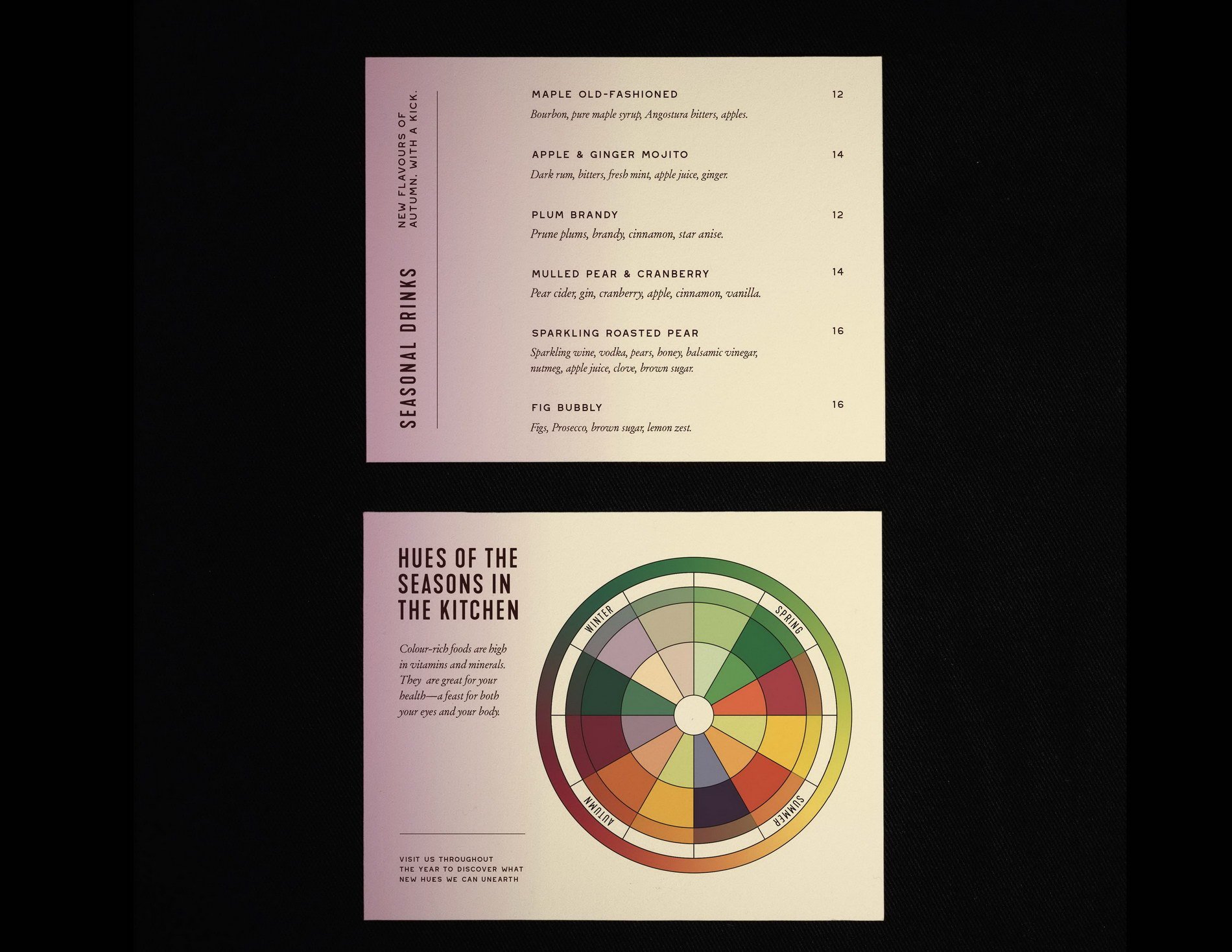
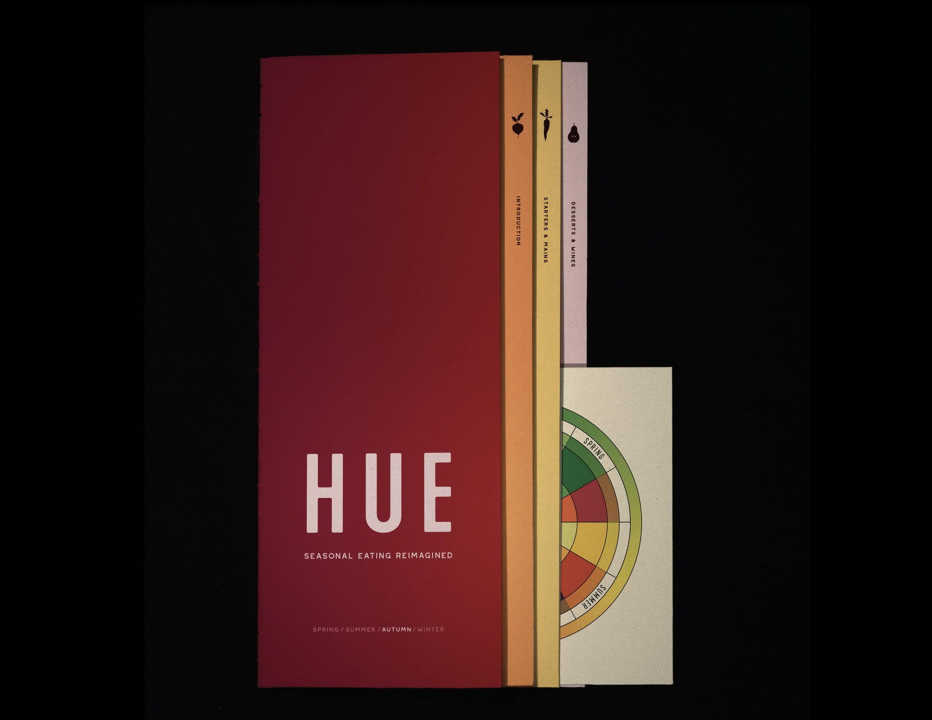
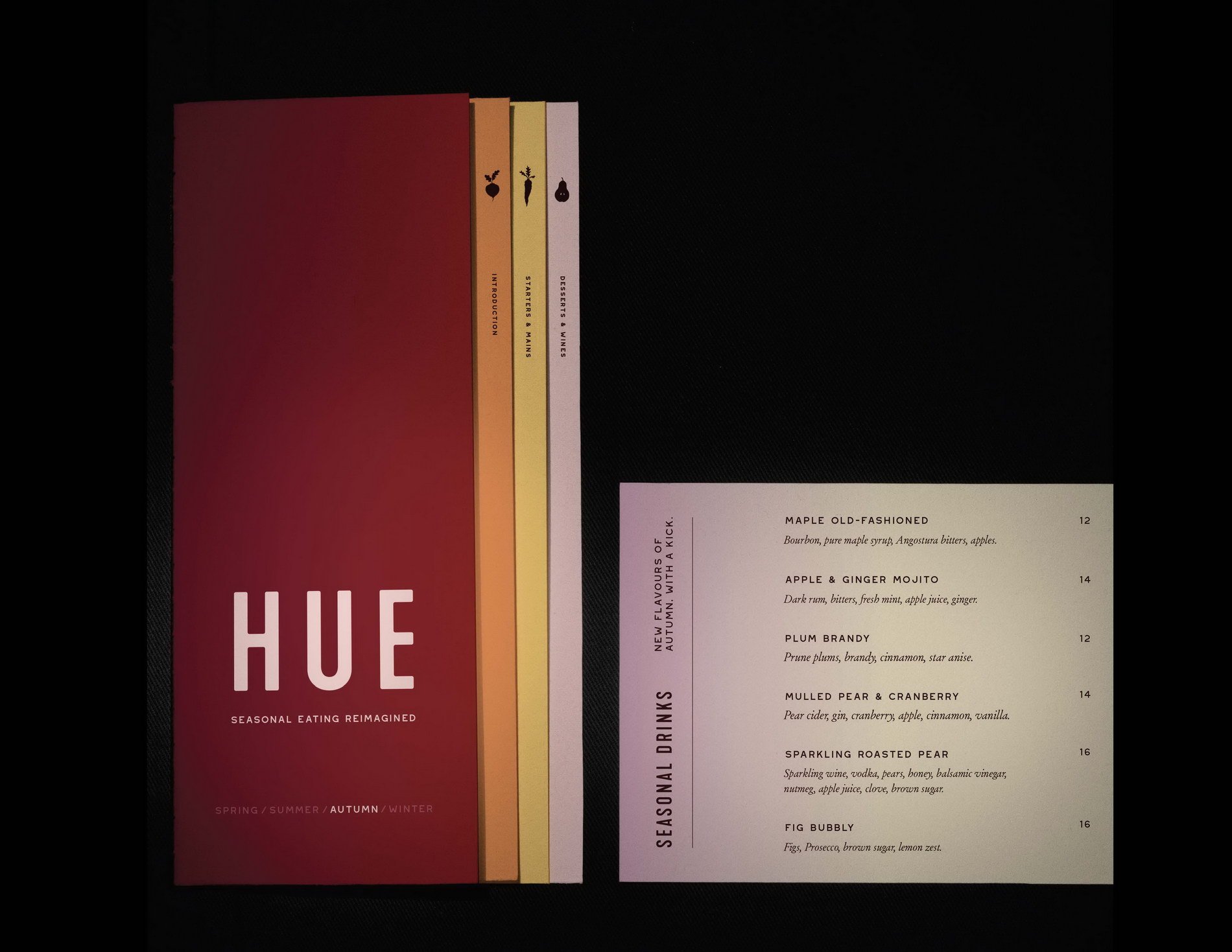
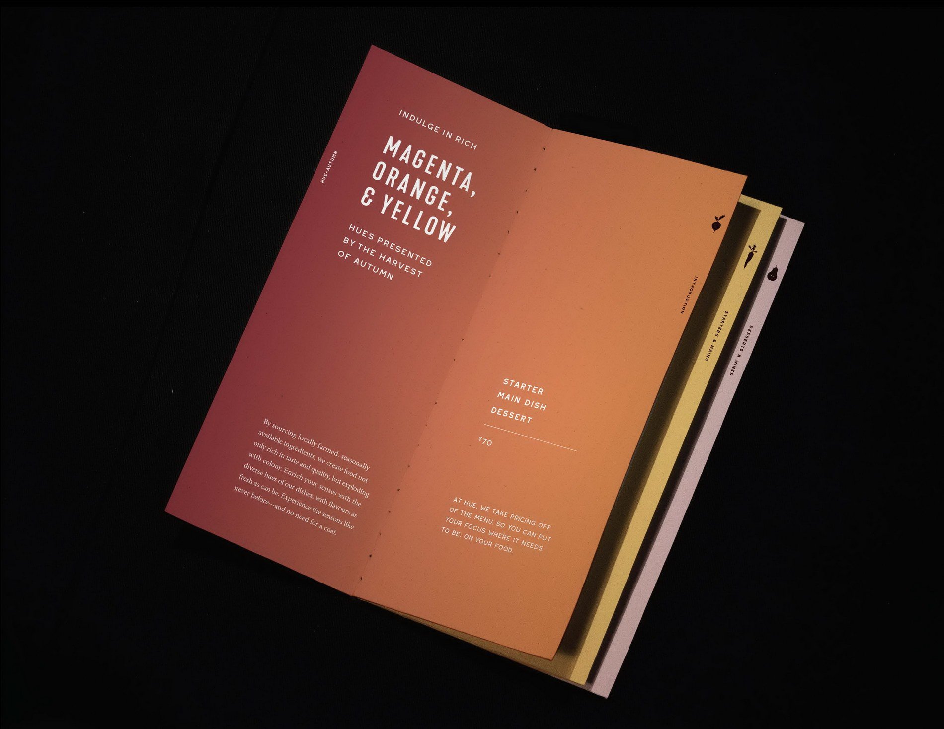
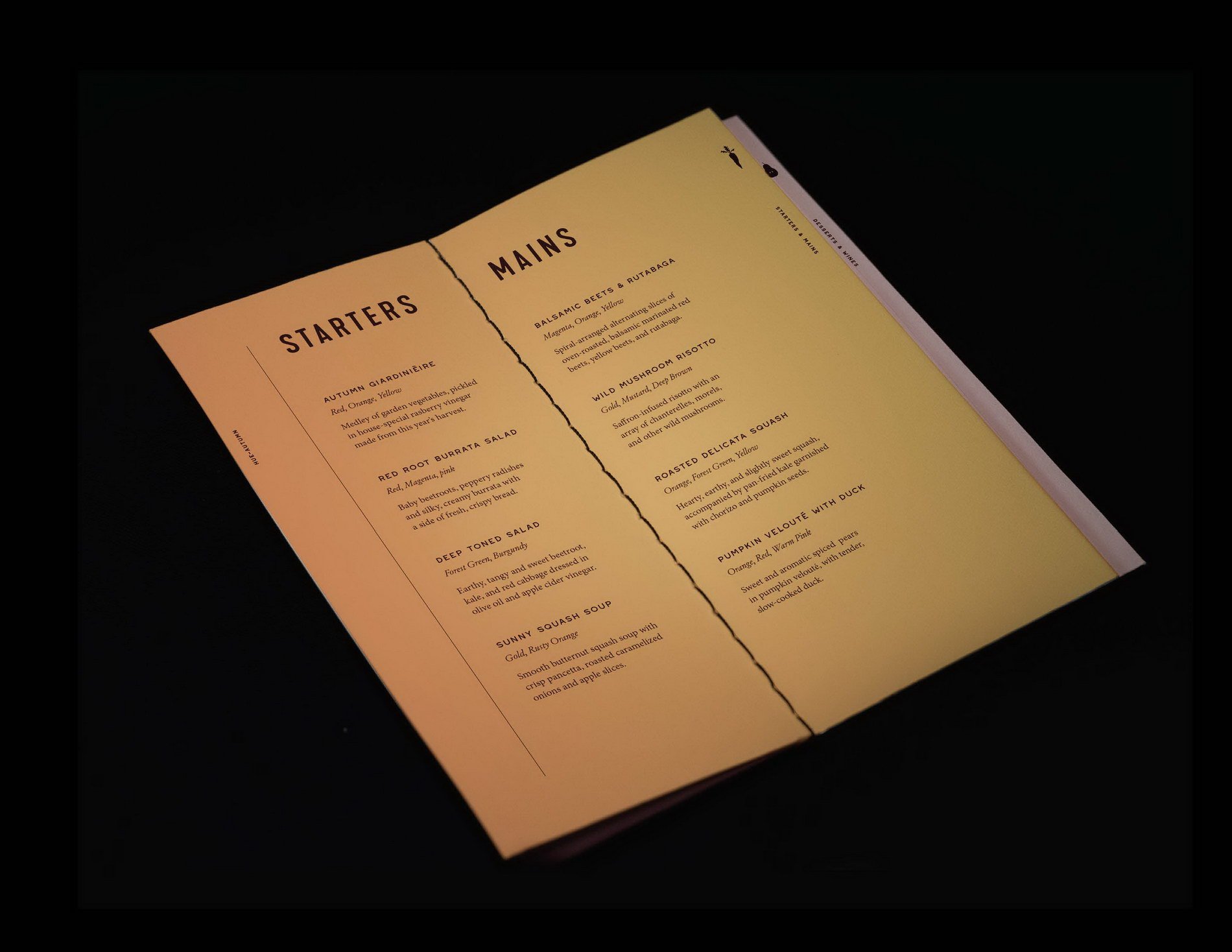
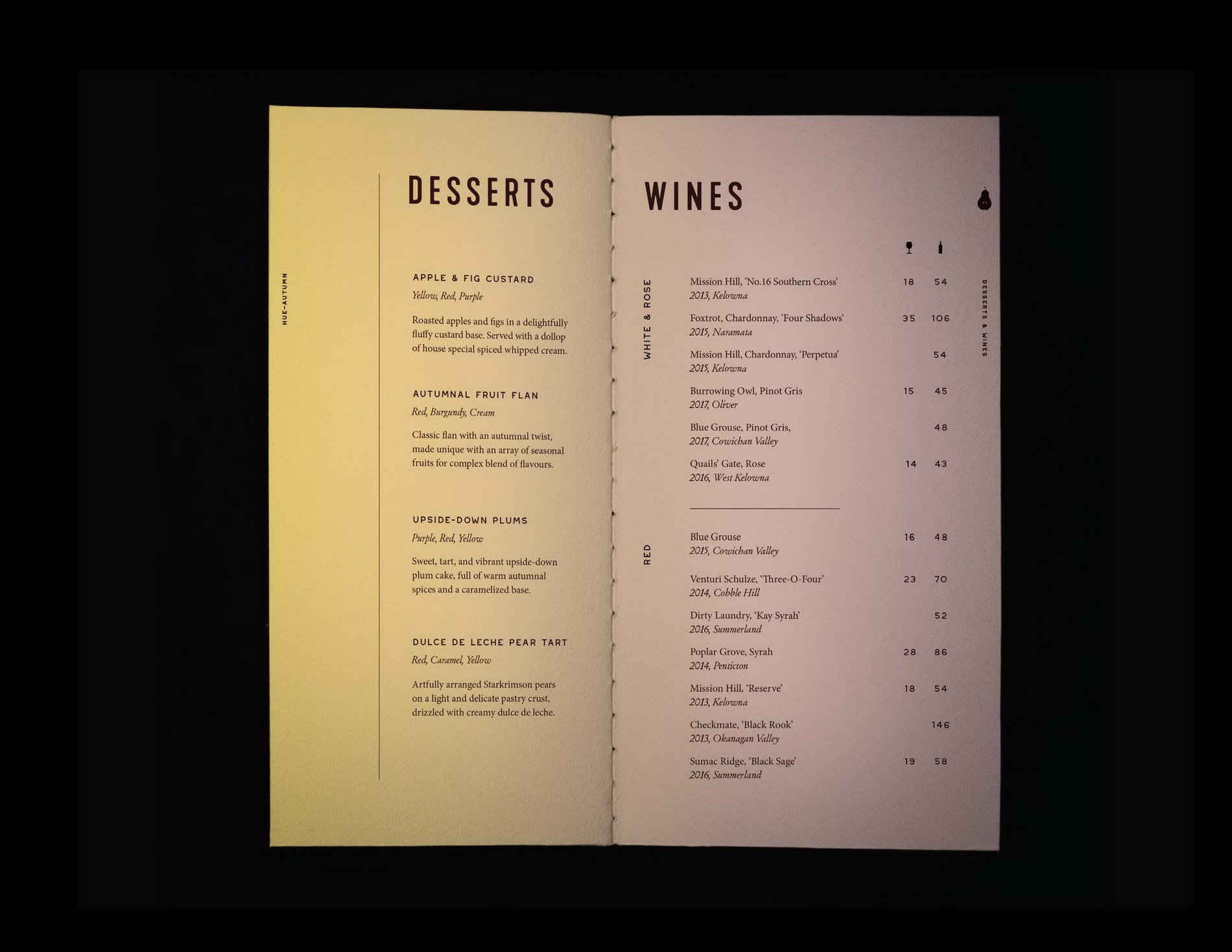
The Menu Series
Hue’s menu had to equally reflect the importance of seasons and colour. It does so by displaying various shades of gradiented paper inspired by the hues of autumnal produce, and putting written focus on key seasonal ingredients. All items on the menu are carefully selected for their colour and use of seasonal food.
The typography is inspired by old fruit crates—with a more contemporary edge—to subtly tie in the farm-fresh aspect of the brand.
The menu’s booklet-style, multi-page layout takes the viewer on a colourful journey of discovering the possibilities of seasonal foods, one page at a time. The soft , thick, textured paper communicates quality when in hand.
The accompanying colour wheel is unique to the brand and displays key information on the value of colourful, seasonal foods, building trust with the customer. It remains relevant year-round and could be applied to other restaurant items such as aprons, coasters, and napkins.
About the Course
Thematically structured around the concept of “design for good”, this course introduces a variety of creative briefs, research methods, leadership skills, and tools that model best practices. Students work in groups to deconstruct the briefs, build on the research, identify tasks, map workflow, explore and define problem-solving strategies, and build solutions and case studies. Students concentrate on branding for project deliverables.


