
IDEA Grad 2021 prints a letterpress poster at Vancouver’s Porchlight Press for sustainable design course
IDEA’s second-year Grad 2021 design class @ideatwentyone recently spent an afternoon getting their hands dirty during a workshop at Vancouver’s Porchlight Press (@porchlightpress). It was amazing to see all the old machinery still in use. IDEA students study the history of printing and printing techniques in their first year Survey of Design class. It is these same presses—some of them over a hundred years old—that are still being used by letterpress studios today! These presses are no longer being manufactured, so when parts break, letterpress printers sometimes have to become metalwork Macgyvers and make new ones from scratch.

The Heidelberg windmill press is one of many presses at Porchlight Press
The focus of our second-year Monday class this term is sustainable design, so we thought a poster about what sustainable design means to our students would make a perfect project. Sustainability can be interpreted in so many ways. We are exploring it through the lens of how young designers and illustrators can have a rewarding and lasting career in our industry, while making a positive contribution to society. Working in pairs, the students wrote an aspirational line of text for their poster. They then chose a typeface to use. In letterpress printing, lines of text are composed using individual metal letters.

Metal letters in tray
For very large type, the letters are made of wood.

Wood type
These individual letters are where the term “font” comes from—a font is the actual physical piece of metal or wood. Type is kept in trays called California Job Cases.
Job case draws

Emma Sun and Sarah Haglund using the job case chart for guidance
Each typeface and type size has its own tray. Inside the trays each letter has it’s own compartment as indicated on the chart above. Even periods have their own little box. Like the presses themselves, the fonts are no longer being manufactured (with a few unique exceptions).

Fonts in case
Having picked a typeface and size, the individual letters are lined up on a composing stick. Amy Asin composed the title for our poster in 60pt Franklin Gothic Outline. Letters have to be placed back to front and upside down, so the typesetter has to pay attention!

Amy Asin composes the poster title

Haluka Yagi, Sophie Young, Logan David and Amy Asin discussing typesetting.
It was really fun seeing all the different typefaces the students chose. To round off our design, the students decided to include some of the interesting printers’ ornaments on offer. Ornaments are small metal or wood images or patterns that were traditionally used to decorate texts.
The most famous ornament is possibly the manicule or pointing hand (from the Latin word manicula, meaning "little hand”). Aidan Zecchel and his partner Rachel Wong decided to use a manicule ornament to draw extra attention to their line.

Aidan Zecchel exploring manicule options
Porchlight has some very unusual ornaments, including the little camels that the class decided to put at the bottom of their poster. Since many populations around the globe depend on camels for their sustainability, it seemed appropriate—and the ornament is so cute!

Amy Asin, Haluka Yagi, and Sophie Young looking at ornament options
Once all the lines of text were ready to go, Annie carefully removed the composing sticks and expertly assembled the texts on Porchlight’s Vandercook press.

Lines of text assembled on the Vandercook proofing press.
Annie showed the class how to line up the paper on the press.

Annie Axtell demonstrates how to line up the paper
Each student was then able to have a turn at printing a poster.

Sharleen Ramos with the final poster

Lera Kim with the final poster
We are very grateful to Porchlight’s founder, Heather Braun, for inviting us to come and give letterpress printing a try. A very big thank-you also to workshop facilitator Annie Axtell @annieaxtell and printer Lea Sanchez Milde for their help. Annie, Lea, Heather and the team at Porchlight made us feel so welcome and provided us with such a great experience.

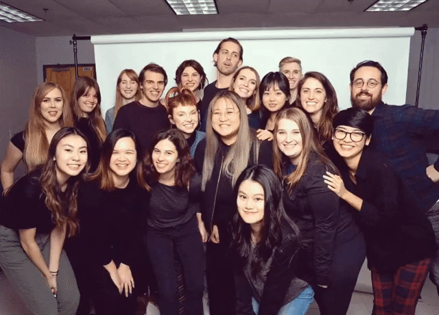
Annie Axtell left and Grad 2021 with their beautiful letterpress posters.

Poster close-up: Grad 2021’s reflections on what sustainable design means
Porchlight Press is currently hosting one of our 4th-year practicum students, Jominca Engelbrecht, so stay tuned for more exciting letterpress stories!