IDEA 235 and COMM 190 Collaborate on an Illustrated Story Project
by Tom Duguid, Instructor IDES235
This project was a collaboration between Communications 190 writing class and IDES 235 Illustration class. The intent was to create a project that mimicked a real world situation, where a writer would create a magazine story, and an illustrator would be employed to design an illustration that would visually introduce the story in a magazine. Comm 190 writers were paired with an IDES 235 Illustrator. The results were impressive, and the students of both classes really enjoyed the collaborative development.
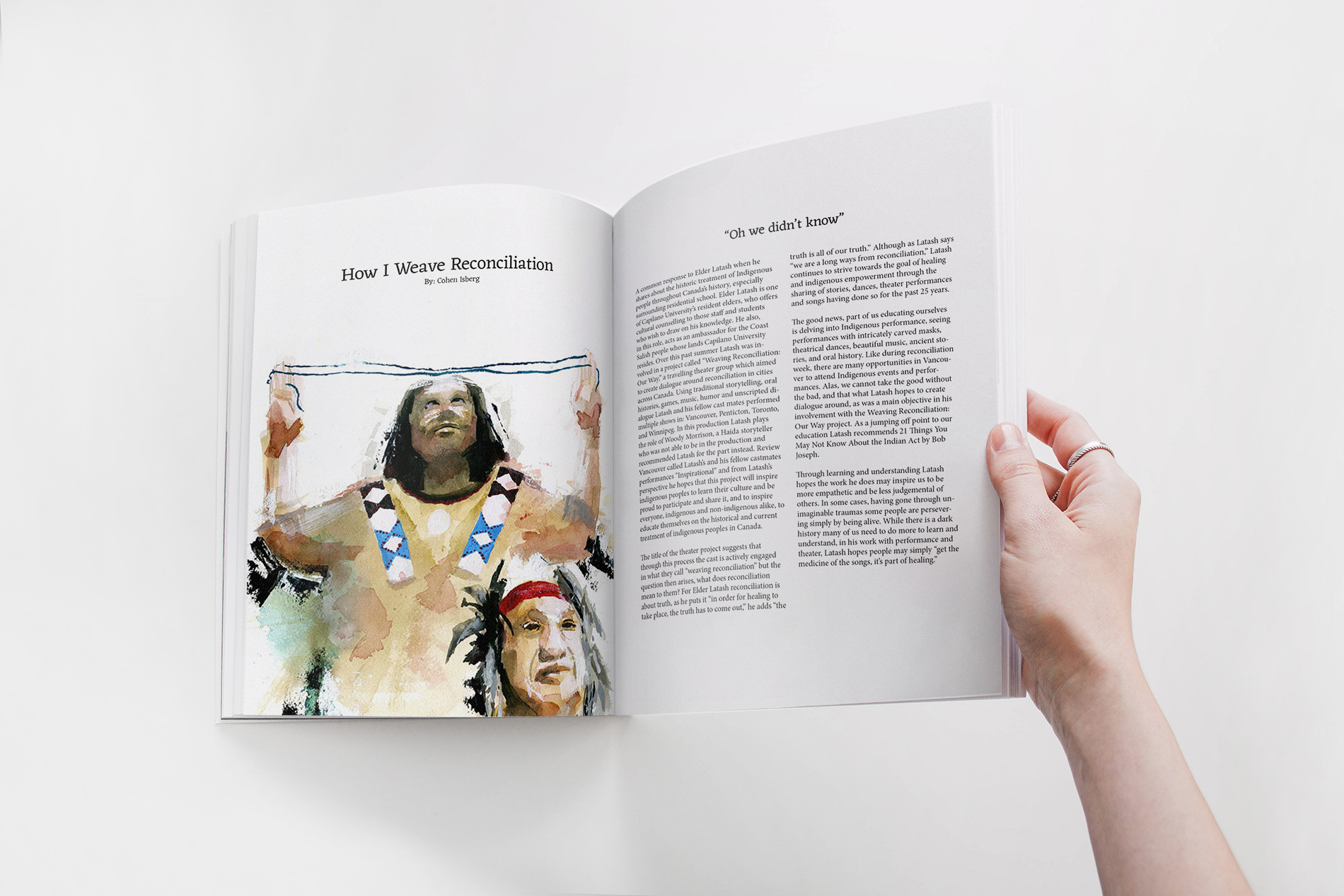
Aidan Zecchel—How I Weave Reconciliation
The communications student I was paired with is named Cohen Isberg. He wrote an article about Elder Latash (CapU resident elder) and his involvement with "Weaving Reconciliation Our Way" a travelling theatre group aiming to open up the dialogue about reconciliation across Canada using traditional storytelling methods. He also writes about the importance of spreading awareness about the history surrounding the treatment of indigenous people of Canada for the truth must be acknowledged for healing to occur. I used an expressive illustration style with traditional mediums to reinforce the optimistic energy behind the message, the background figure's open arms not only symbolize the invitation to join the dialogue but also nod to a Coast Salish welcome gesture.
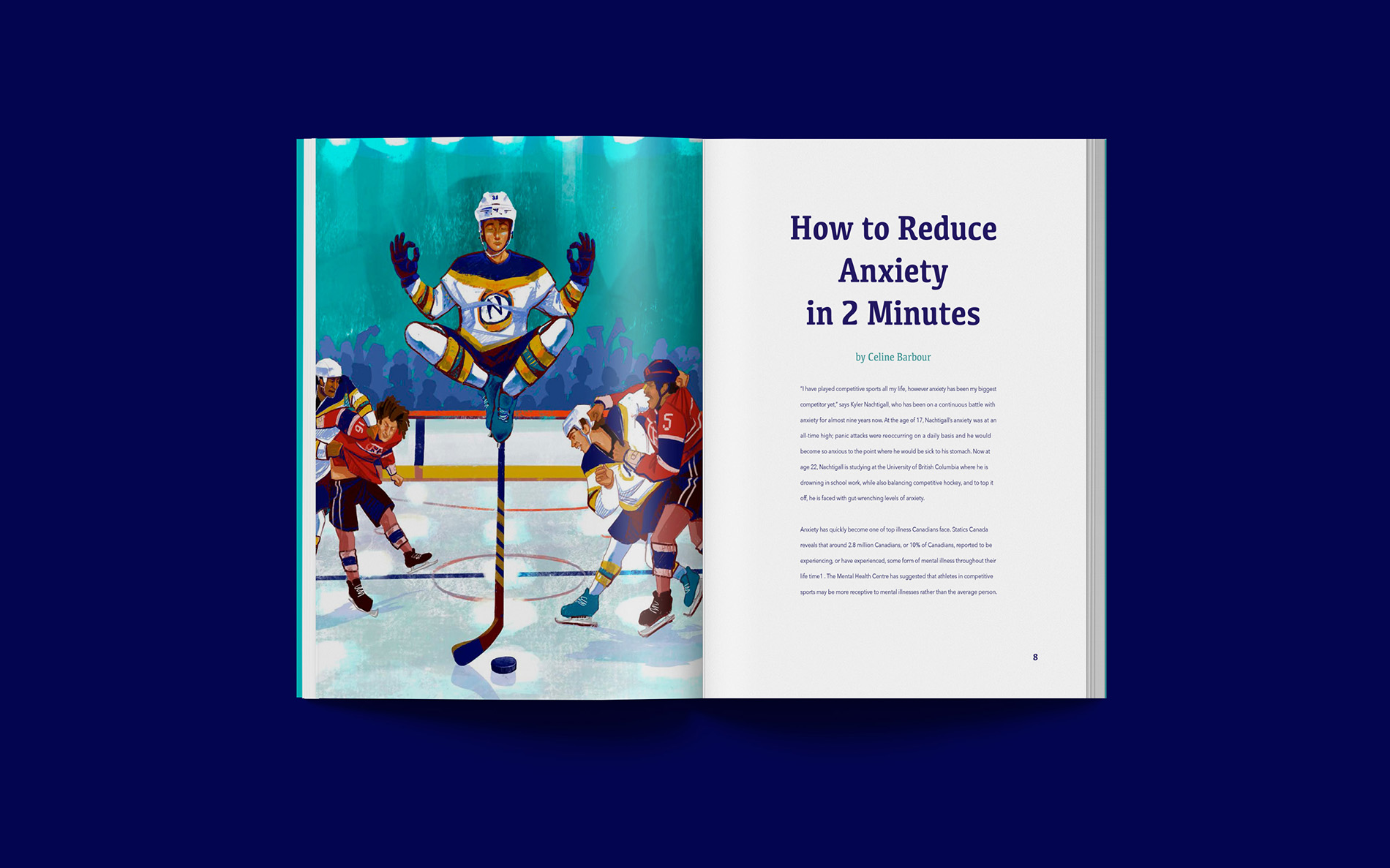
Anna Tsybulnyk—How to Reduce Anxiety in 2 Minutes
The article is about Nachtigall who plays competitive sports like hockey. His anxiety gets really high before and during the games so his only escape is in the unique meditation technique of his own.
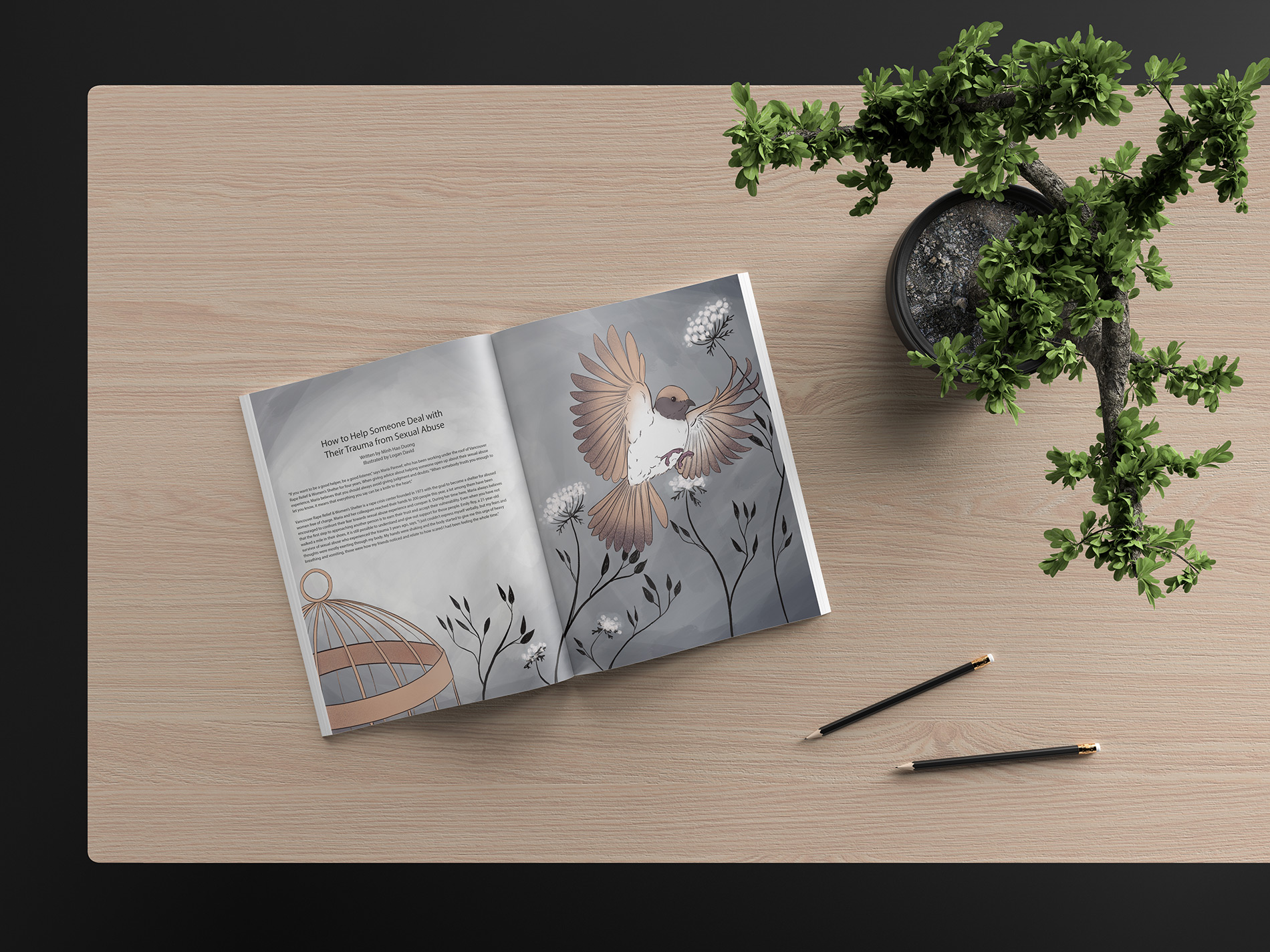
Logan David—How to Help Someone Deal with Their Trauma from Sexual Abuse
For my illustration, I chose to take a metaphorical approach rather than a literal one, especially since sexual trauma is such a serious and traumatic topic. The article was about coping with sexual abuse, but overall, the article was positive and uplifting. I explored visual metaphors for liberation and eventually settled on a bird flying from a cage, which is meant to mirror the abuse survivors escaping their past abuse.
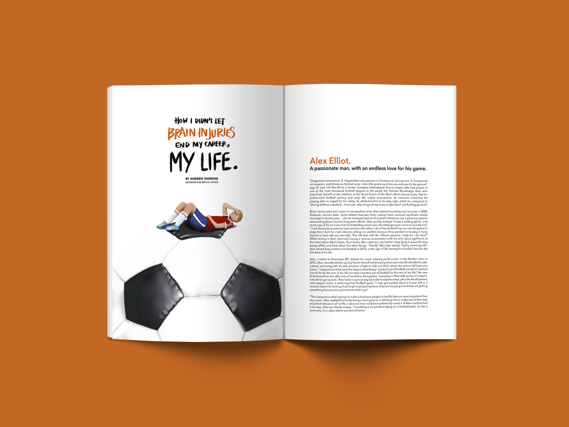
Rachel Wong—How I Didnt Let Brain Injuries End My Career, My Life
I loved collaborating with Andrew Shoring from the COMM190 class on this project! Andrew's article was about the post-concussion experiences of his CapU Men's Soccer Team Coach, Alex Elliot (a former Canadian International Soccer Player). Andrew gave me free rein as to what I could illustrate to accompany the article, so it was a fun experience being able to explore all my options. I'm glad I had the opportunity to do this project, as it gives me real-world experience in collaborating with a writer!

Sara Nguyen—How to Survive in a Restaurant Kitchen
"How to Survive in Restaurant Kitchen" is an interview with the chef, Nick Pushkarev, where he shares his day-to-day experience of cooking for hundreds of people and gives tips on how to get through it unscathed. While reading Maria's article, phrases like "it was a battlefield," "nerves of steel," and "don't cut yourself" really popped out at me. I figured that the chaotic environment and dangers you can face as a chef—the falling knives, the flaming hot stoves, the scalding panhandles—needed to be emphasized. So, I supersized them. This illustration shows the journey an everyday chef who needs to maneuver their way through the perils in the kitchen to get to their end goal.

Naomi Evers—How I Made it to Cannes with my First Film
The focus of my illustration was to show the weight of a Capilano student going to Cannes in France. The rows of suits represent the seats of the theatre of the award show. The Cap sweater stands out among the black tuxes but at the same time puts it on the same level as everyone else attending the award show.
Sara Lilley—How I Counsel Students with Anxiety
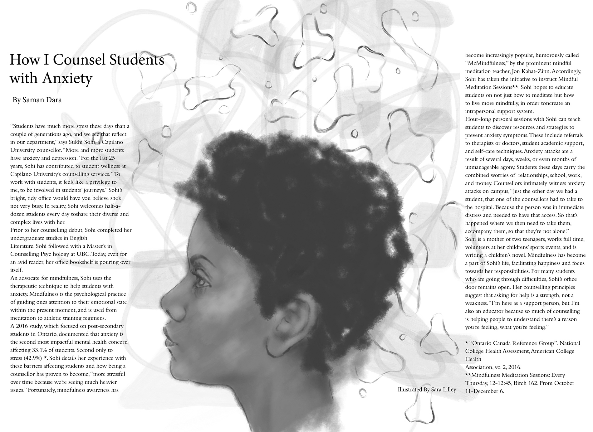
When starting this illustration I didn't want to wanted to illustrate the negative effects of anxiety on students. I wanted to focus on that people and their strength. Trying to turn anxiety into mindfulness is about not dwelling on the past or worrying about the future. Grounded and strong is how I wanted to illustrate anxiety.
Sarah Haglund—How To Cliff Jump
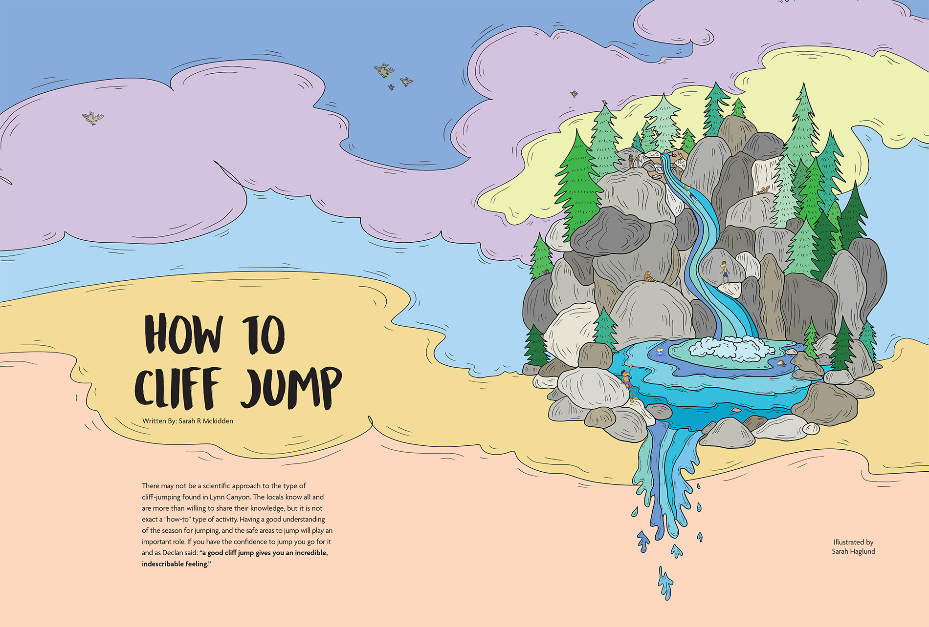
I worked along side Sarah R McKibben for this editorial piece. Sarah’s story was about the impacts of cliff jumping a Lynn Cannon. Whether it is the safety precautions or the major adrenaline rush—as the person jumping you feel as if you are in your own fantasy world. I achieved this design through a lot of brain storming, sketches and used Photoshop to execute the project. Sarah’s story was a joy to read and I hope I was her and the stories voice through the imaginary. It was a pleasure doing the collaboration with her.

Sharleen Ramos—Court Illustration
This conceptual illustration was created for Bridget Stringer-Holden's article about how Peter Holden's teaching style engages law students. He is a professor here at Capilano and the article describes how he does a moot court exercise with students. The illustration combines a few images from the law (Lady Justice and the Scales) with education. Lady Justice is using a watering can to "grow" the "plant" students, with Mr. Holden looking up at them. He is more grown than the students and is heavier on the scales.
Sophie Young—How to Use Gender Pronouns with a Trans-Individual
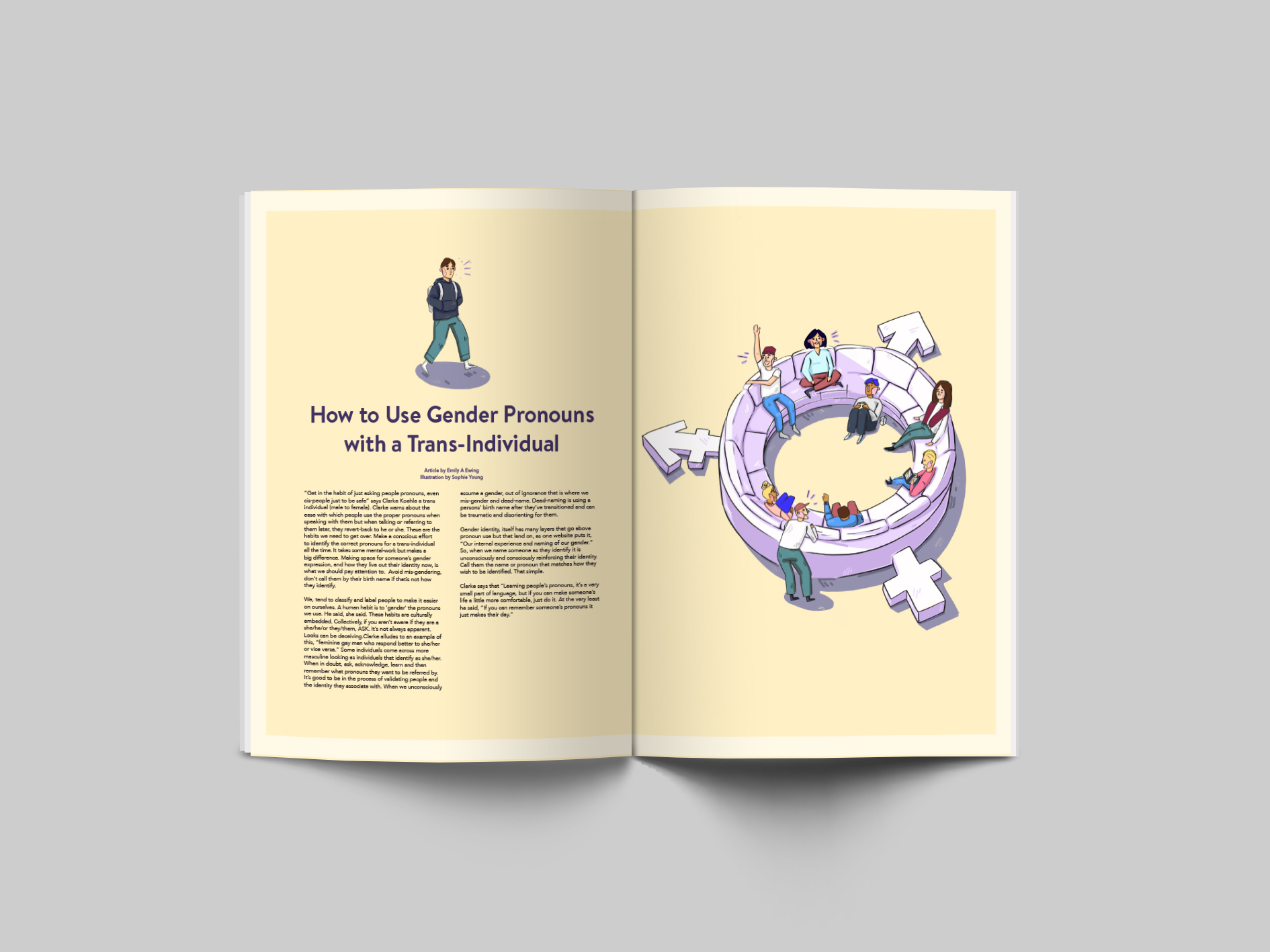
For this editorial illustration, I was given "How to Use Gender Pronouns with a Trans-Individual", an article written by Emily A Ewing. It highlights the negative psychological and social impacts it has on transitioning individuals and how the simple act of using their preferred pronouns creates a safe space. I decided to approach this illustration by concentrating on the positive influences that learning others pronouns have. I used a spot illustration to lead the eye to the primary visual, which represents a safe space for gender expression. This layout also leaves room for the reader's own interpretation and reflection. As for style, I chose light muted colours and rounded typefaces to help display the empathetic and friendly tone of the article.

Sofia Alvarenga—How I Got Paid to Do My First Tattoo
For this project, I was paired up with Nicole Langlais in communication 190. The story was about another student in our IDEA program who got the chance to tattoo a pig farmer on Vancouver Island but instead of getting paid with money, got paid in bacon. Since the story itself was really amusing, I really enjoyed coming up with ideas that could represent it.

Abby Jocson—How I Found the Only Japanese Bathhouse in North America
For this project I was partnered with Sarah Rose Klassen to create an illustration for her piece, "How I Found the Only Japanese Bathhouse in North America". The project was quite fun, and it was an interesting process to interpret a piece of writing and finding ways to convey the words accurately and conceptually.
Valeriya Kim—Just Throw It
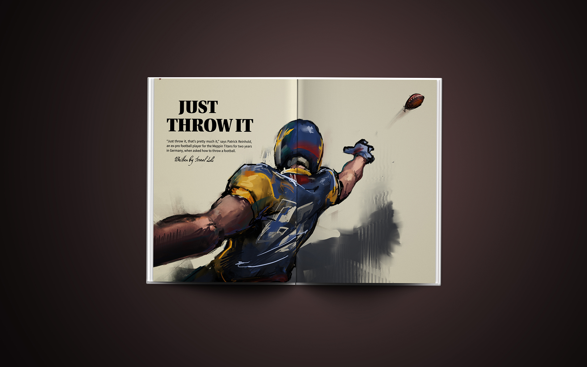
Collaboration with COMM190 was a very valuable experience. Thanks to the opportunity to work with Israel Lobo and his writing skills I was given a chance to explore a topic that I would not usually consider interesting. However, Israel’s story introduced me into the world of American Football, the tension and the hard work put in by the players, which once again revealed many reasons for its popularity. It allowed me to further explore my own style as well as finding ways to shift it in accordance to the topic of the article to express its essence in the most complimenting way. I’m looking forward for more projects that will involve editorial design and illustration!


